Money, money, money!
You, me, or ANY other trader on this planet is in the market to make money. AND those who get to enter at right price makes more money.
Now, Technical Analysis is all about getting that RIGHT price. Analysis of market trends is the first tool that is used in technical analysis. However, trend analysis cannot be done unless historical stock charts are available.
This is because trends are discovered in the charts themselves. It is, therefore, critical to understand what is a chart and how to perform chart analysis to excel at technical analysis.
To get the best analysis of the markets, 3 types of charts are majorly used :-
1. Line Chart
2. Bar Chart
3. Candlesticks
We will focus more Candlesticks for a good reason; however, before we get to candlesticks, we will understand why we don’t use the line and bar chart.
The Line Chart
The line chart is the most basic chart type, and it uses only one data point to form the chart. When it comes to technical analysis, a line chart is formed by plotting a stock’s closing prices or an index.
A dot is placed for each closing price, and a line then connects the various dots.
If we are looking at 60-day data, then the line chart is formed by connecting the closing prices’ dots for 60 days.
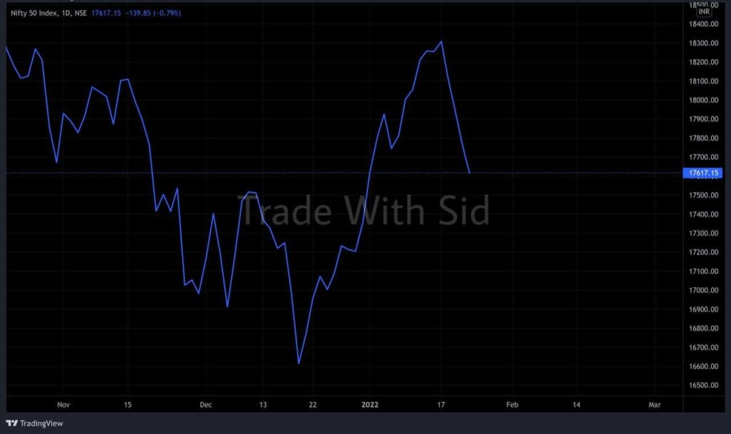
The line charts can be plotted for various time frames, namely monthly, weekly, hourly etc.
Advantage :
No doubt, simplicity of line chart is its biggest advantage.
With one glance, the trader can identify the general trend of security.
Disadvantage :
Ironically, Disadvantage of line chart is also it’s simplicity!
Besides giving the analysts a view on the trend, the line chart does not provide any additional detail.
Plus the line chart takes into consideration only the closing prices ignoring the open, high and low. For this reason, traders prefer not to use the line charts.
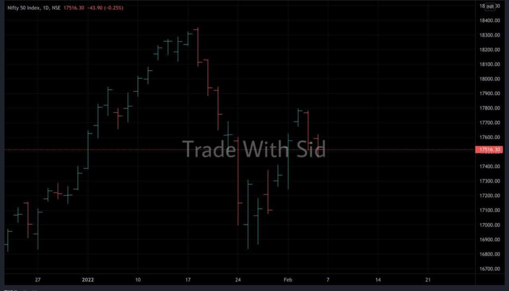
Bar Chart
As compared to Line chart, it’s a bit more versatile.
A bar chart displays all four price variables: open, high, low, and close.
A bar has three components:-
1. The central line – The top of the bar indicates the highest price the security has reached. The bottom end of the bar indicates the lowest price for the same period.
2. The left mark/tick – indicates the open.
3. The right mark/tick – indicates the close.
For example, assume the OHLC data for a stock as follows:
Open – 65
High – 70
Low – 60
Close – 68
For the above data, the bar chart would look like this:
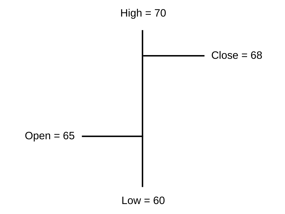
As you can see, in a single bar, we can plot four different price points. If you wish to view 5 days chart, we will have 5 vertical bars of 1D Time Frame, as you would imagine.
If the left mark (Opening Price) is lower than the right mark (Closing Price), it represents that we had a positive bar (Open < Close).
For example consider this: O = 46, H = 51, L = 45, C = 49. To indicate it is a bullish day, the bar is represented in green candle.

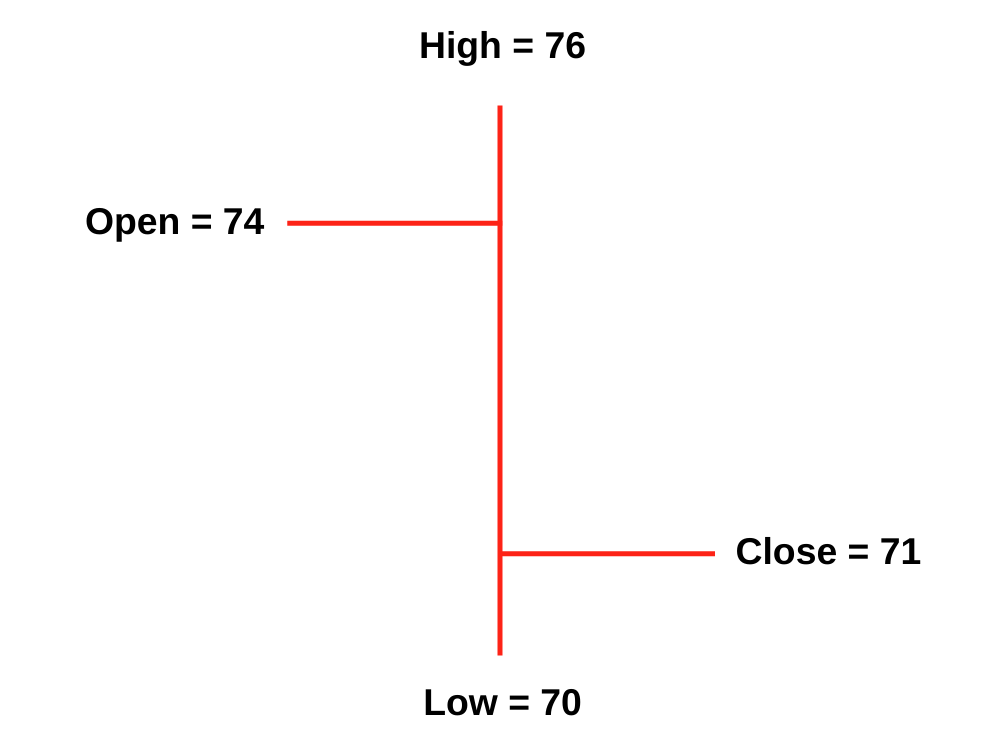
Likewise, if the left mark (Opening Price) is higher than the right mark (Closing Price), it represents that we had a negative bar (Open > Close).
For example consider this: O = 74, H=76, L=70, C=71. To indicate it is a bearish day, the bar is represented in red color.
The length of the central line indicates the range for the day. A range can be defined as the difference between the high and low. Longer the line, bigger the range, shorter the line, smaller is the range.
Disadvantages:
It lacks visual appeal.
It’s tough to spot potential patterns here.
Requires much practice to analyze charts quickly. This is the core reason why traders do not use bar charts.
I strongly recommend using Candlesticks as its used by majority of traders as well. Let’s see why so..
Candlesticks
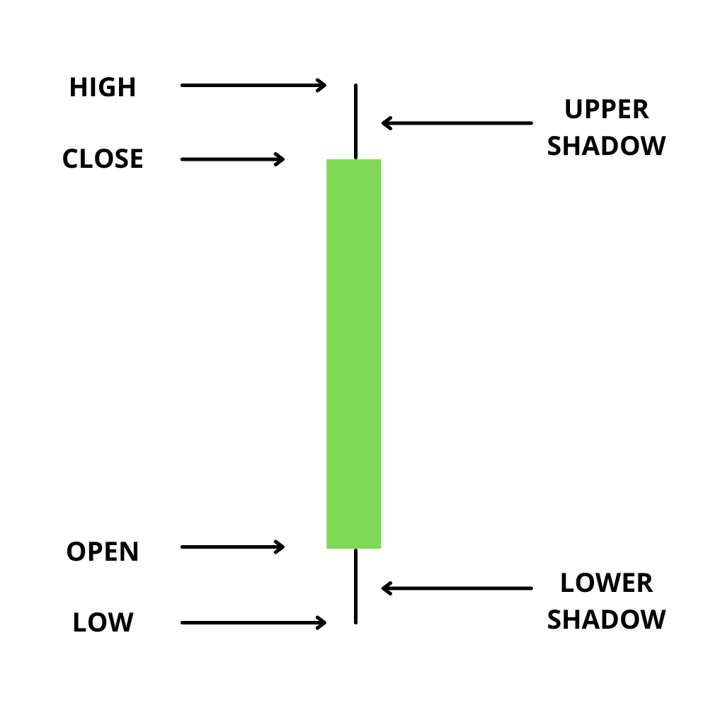
Candlesticks are the first choice of majority of traders and I don’t wonder why so. In a candlestick the open and close prices are displayed by a rectangular body which makes it very easy to read the prices.
Candles can be classified as a bullish or bearish candle usually represented by Green/Red candles, however these colors can be customized.
Candlesticks consist of 3 components :-
1. The Central real body – The real body, rectangular connects the opening and closing price.
2. Upper shadow – Connects the high point to the close.
3. Lower Shadow – Connects the low point to the open.
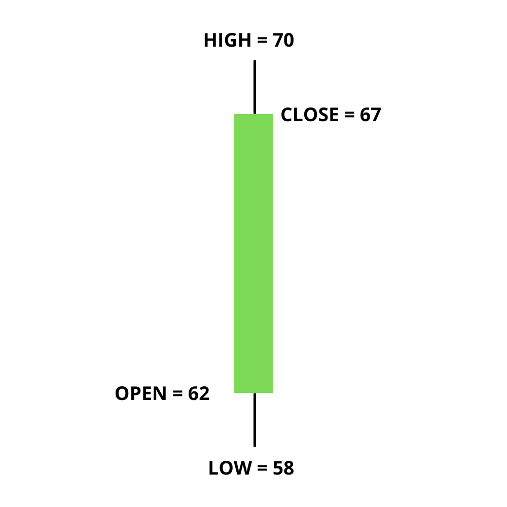
Let us look at the Bullish Candle –
Have a look at the image below to understand how a bullish candlestick is formed:
This is best understood with an example. Let us assume the prices as follows.
Open = 62
High = 70
Low = 58
Close = 67
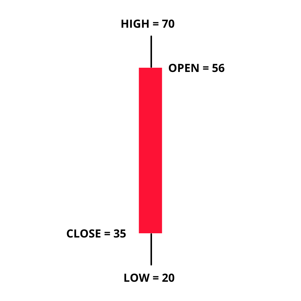
Let us look at the Bearish Candle –
Have a look at the image below to understand how a bearish candlestick is formed:

This is best understood with an example. Let us assume the prices as follows.
Open = 56
High = 70
Low = 20
Close = 35
Here is a little exercise to help you understand the candlestick pattern better. Try and plot the candlesticks for the given data.
| No. | HIGH | OPEN | CLOSE | LOW |
| 1 | 44 | 30 | 25 | 20 |
| 2 | 40 | 25 | 35 | 23 |
| 3 | 50 | 35 | 47 | 30 |
If you find any difficulty in doing this exercise, please ask your query in the comments at the end of this chapter.
Once you understand the way candlesticks are plotted, reading the candlesticks to identify patterns becomes a lot easier.
This is how the candlestick chart looks like if you were to plot them on a time series. The green candle indicates bullishness and red indicates bearishness.

Also note, a long-bodied candle depicts strong buying or selling activity. A short-bodied candle depicts less trading activity and hence less price movement.
To sum up, candlesticks are easier to interpret in comparison to the bar chart. Candlesticks help you quickly visualize the relationship between the open and close and the high and low price points.
Key Takeaways from this chapter –
1 – Conventional chart type cannot be used for technical analysis as we need to plot 4 data points simultaneously.
2 – A line chart can be used to interpret trends, but no other information can be derived.
3 – Bar charts lack visual appeal, and one cannot identify patterns easily. For this reason, bar charts are not very popular.
4 – There are two types of candlesticks – Bullish candle and Bearish candle. The structure of the candlestick, however, remains the same.
5 – When close > open = It is a Bullish candle. When close < open = It is a Bearish candle.